Brand Guidelines
This page outlines how you can do your part in helping us achieve this resonance, providing fundamental design principles, messages, and how to use the assets provided.
Brand Guidelines
This page outlines how you can do your part in helping us achieve this resonance, providing fundamental design principles, messages, and how to use the assets provided.
At Commune, we’re driven by a commitment to Intentional Design and fostering connecting with nature and one another — something we call Togetherness. To this end, we place careful attention on how our brand is expressed to the world, ensuring our message and standards resonate deeply with our audiences.
We’d be delighted to assist if you require any support. Please get in touch with us at together@commune.cc if you have questions or require additional content.
01 - Brand voice
Our language and word choice is deeply tied to our identity, and we pride ourselves on having developed thoughtful descriptions and phrasing that can be used across all consumer touchpoints to help educate and inspire audiences. Please help us remain consistent by noting the below preferred language.
Commune is designed for those who see — and seek — the opportunity to create change. Those who appreciate the abundance of beauty and generosity inherent in nature. Those who know that the individual choices we make contribute to something bigger.
Born In Somerset
Founded in the British county of Somerset, we look to nature’s lush, generous landscapes in our search for a more balanced life, ancient wisdom, and a return to true community.
Nature’s Scents
We look to herb-lore and ancient combinations to reconnect with traditional ways of being.
Togetherness
Commune exists to build and foster connection, bringing us closer to nature and one another.
Intentional Design
We obsess over design — especially where it can help us build a more sustainable product.
Responsibility
Our most important stakeholder is nature.
We refrain from using the below words/phrases to describe our brand and products:
❌ Eco-friendly
❌ All-Natural
❌ Aroma
Preference is to use:
🌱 Natural
🌱 Botanical
🌱 Sustainable
🌱 Scent, Fragrance
🌱 Designed to Last
🌱 Zero-Plastic
02 - Logos
Our monogram logo should only be used in black and white versions and should be centred in all instances. Although the logo is not square, it should be positioned within a square bounding frame. Maintain a padding of at least 1/5th of the logo's height around the edges when in use. The minimum height should be 10mm in print or 50px on screen.
WeTransfer link contains PNG, PDF, SVG.
Download All Logotypes
24 Files - 1 Mb
Similar to the CCC monogram, our wordmark logotype should be used in black and white only. It should appear in black when on beige/white backgrounds; and in white when on black backgrounds. You may also use the white logotype on top of our brand photography, but please ensure clear legibility and avoid obstructing faces.
WeTransfer link contains PNG, PDF, SVG.
Download All Logotypes
24 Files - 1 Mb
03 - Colours
Our core brand colours are extremely minimal and use only black and white. We aimed to redirect the focus from colour as a branding tool, opting instead to develop our distinct visual identity through meticulously crafted graphic shapes, typography, and photography. Additionally, we utilise colour on our bottles and packaging to denote scent families, necessitating simplicity in our core brand colours to prevent clashes.
White
HEX: #FFFFFF
RGB: 255/255/255
CMYK: 0/0/0/0
Black
HEX: #000000
RGB (0, 0, 0)
CMYK: 60/40/40/100
Pantone: Black C
At present, we offer just one scent family – Seymour. However, as we broaden our range, each scent family will be assigned a specific colour for use on aluminium bottles and external packaging. In addition, each scent family will have a unique photographic art direction, which will enable customers to promptly identify their preferred fragrance and its respective visual world. For example, our upcoming scent, Montague (release in Fall 2026), will feature a terracotta clay colour.
Seymour Scent
HEX: #F1EAC8
RGB: 241, 234, 200
CMYK: 6,7,37,0
Pantone: 7499 C
Montague Scent
HEX: #DBB198
RGB: 219, 177, 152
CMYK: 0,30,38,16
Pantone: 7514 C
04 - Typography
Our hero typeface – Solstice – by British designer Gareth Hague, enables us to apply our visual identity to any written word. It is best used sparingly for maximum impact in headlines, slogans, and brief highlights. It was crafted using the same shapes as our wordmark and CCC monogram, referencing the distinct curves of British Gothic architecture.
Solstice is an uppercase-only font. However it offers an array of decorative alternative characters, and multiple ligatures have been drawn to evoke a sense of connection within each word, echoing our essence of togetherness and community.
Request Download Access
together@commune.cc
Aa Bb Cc Dd Ee Ff Gg Hh Ii Jj Kk Ll Mm Nn Oo Pp Qq Rr Ss Tt Uu Vv Ww Xx Yy Zz 0123456789( )
*!?&$
Aa Bb Cc Dd Ee Ff Gg Hh Ii Jj Kk Ll Mm Nn Oo Pp Qq Rr Ss Tt Uu Vv Ww Xx Yy Zz 0123456789( )
*!?&$
Span, a highly versatile font by British typographer Jamie Clark, epitomises a distinct engraved heritage thanks to its sweeping serifs and sculptural forms. Its elegant design effortlessly merges the contemporary with the traditional, making it the ideal body copy companion to Solstice.
While Span is available in a plethora of thicknesses and cuts, we restrict its use to Regular, Italic, and Bold for consistency.
Span is Available via Adobe Fonts
Aa Bb Cc Dd Ee Ff Gg Hh Ii Jj Kk Ll Mm Nn Oo Pp Qq Rr Ss Tt Uu Vv Ww Xx Yy Zz 0123456789( )
*!?&$
Aa Bb Cc Dd Ee Ff Gg Hh Ii Jj Kk Ll Mm Nn Oo Pp Qq Rr Ss Tt Uu Vv Ww Xx Yy Zz 0123456789( )
*!?&$
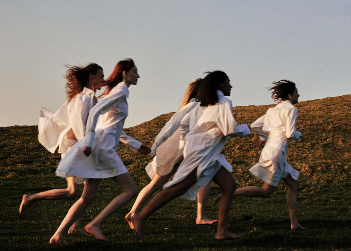
05 - Photography
Our lifestyle photography reflects our identity as a self-care brand forged through a sense of community and togetherness. This imagery showcases our references to ancient Pagan cultures across Somerset, and our belief in the transformative powers of daily ceremony and connection to our natural landscape.
Updated 23rd March 2026
Download LOW RES Images
20 Files - 74 Mb
Download HIGH RES Images
24 Files - 446 Mb
Download Holiday Lifestyle Images
16 Files - 44.1 Mb
Download Handcream & Voyagers Images
15 Files - 76 Mb
Download In-Situ Images


Our lifestyle photography reflects our identity as a self-care brand forged through a sense of community and togetherness. This imagery showcases our references to ancient Pagan cultures across Somerset, and our belief in the transformative powers of daily ceremony and connection to our natural landscape.
WeTransfer link contains JPEG in RGB.
Download Seymour Product Images
256 Mb
Download The Voyagers Images
9.8Mb
Download Candle Product Images
152 Mb
Download Accessories Product Images
35 Mb